The modern art of colour psychology suggests that colours have a profound effect on our emotions and physical well-being. The hues we choose to surround ourselves with can significantly impact our mood and overall feelings. Whether you’re redecorating a room or designing a new space, understanding colour psychology can help you create an environment that resonates with your emotions.
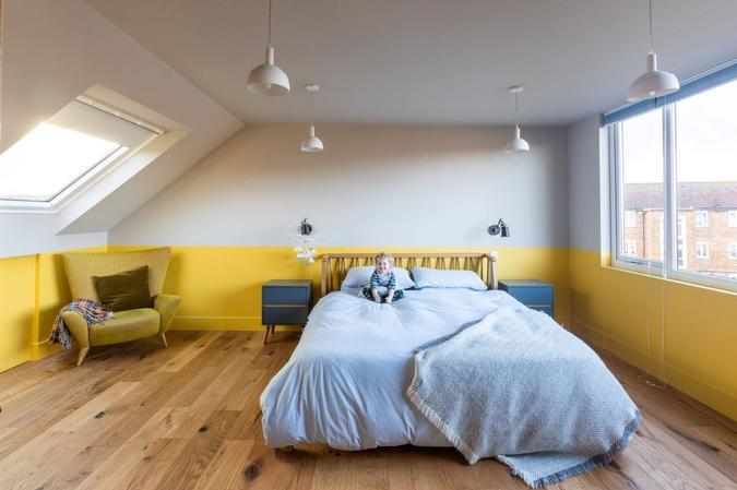
1. Energising yellow
Yellow radiates positivity and energy. It evokes feelings of summer, happiness and warmth, making it an excellent choice for certain areas of your home.
Best Uses:
- Kitchens: Yellow stimulates appetite and encourages a lively atmosphere during meal preparation.
- Bathrooms: Bright yellow can uplift your spirits during morning routines.
- Home Gyms: If you’re fortunate enough to have a gym at home, yellow can motivate your workouts.
Caution: While yellow is invigorating, excessive exposure may lead to irritability. Avoid using it in bedrooms, where tranquillity is essential. The colour psychologist Carlton Wagner was quoted as saying that ‘Babies cry more, and temperamental people explode most quickly, in yellow rooms.’
2. Restful blue
Pale blue creates a serene ambiance, perfect for spaces where relaxation and rest are paramount.
Ideal Locations:
- Bedrooms: The calming effect of blue promotes better sleep quality.
- Playrooms: Blue is said to encourage imaginative play as the mind can wander and create in a calm setting.
Tip: Be mindful of the shade — blues can be icy or grey and can make a room feel chilly, especially if it’s north facing. Test a few samples before committing.
3. Natural green
Green embodies nature, combining the calming qualities of blue with the vibrancy of yellow.
Considerations:
- Home Offices: Green fosters concentration and creativity.
- Living Spaces: Use green to connect with the outdoors and create a harmonious environment.
Note: Be cautious in gyms, as green is more likely to induce contemplation than going for the burn.
4. Creative purple
Pale purples ignite creativity and introspection.
Where to use purple:
- Home Studios: Purple encourages artistic expression and deep thinking.
- Reading Nooks: Create a cozy corner with soft lavender tones.
Remember: Balance is key — pair it with greens and mustard yellow
5. Playful pink
Pink is often associated with femininity and playfulness. Whether subtle or vibrant, it’s a colour that can instantly lift your spirits and create a warm atmosphere.
Best Uses:
- Nurseries: Pink is a classic choice for baby rooms. Its gentle hue promotes a sense of comfort and security.
- Home Offices: A dash of pink can infuse creativity and inspiration into your workspace.
- Living Rooms: Use soft pink accents in pillows, artwork, or curtains to add a touch of whimsy.
Caution: Too much pink can become overwhelming. Balance it with neutral tones or complementary colours like green or orange.
6. Subtle peach
Peach, a delightful blend of pink and orange, offers a softer alternative to both. It embodies warmth without being too intense. Peach Fuzz is the Pantone colour of the Year for 2024.
Where to Use:
- Bedrooms: Peach promotes relaxation and tranquillity, making it an excellent choice for a peaceful sleep environment.
- Dining Areas: Soft peach tones create an inviting ambiance for family meals.
- Reading Nooks: Imagine curling up with a book in a cozy peach-coloured corner.
Remember: Peach pairs beautifully with neutrals, greens, and blues.
7. Serene beige
Beige, often derided as the slightly dull ‘safe’ option, shouldn’t be overlooked. Associated with natural materials like wood and the wool after which it is named, it exudes a sense of calmness and simplicity.
Positive Connotations:
- Serenity: Beige provides a tranquil backdrop, making it ideal for bedrooms or spaces where relaxation is essential.
- Safety: It symbolizes stability and security, like a warm hug from your surroundings.
- Versatility: Beige acts as a neutral canvas, allowing other colours to shine.
Useful Applications:
- Home Office: Promotes job and financial security.
- Living Room: Creates a stable environment for family relaxation.
- Bedroom: Invites tranquillity and peaceful rest.
Design Tip: Use beige as a neutral base—whether through wallpaper, paint, flooring, or fabrics—to ground vibrant accent colours. If your room is predominantly white, let beige take centre stage. It pairs well with reds and oranges, as well as blues.
Remember, your personal preferences matter most. Trust your instincts when choosing colours for your home. After all, you’ll be the one living with these choices, so make them right for you!
8. Powerful red
Attention-grabbing red provokes intense feelings of excitement, energy and even danger. From earthy brick tones to pillarbox red, there’s always a perfect red to suit your home,
Where to Use:
- Dining room: Red is said to increase the metabolism, which is why it features so prominently in fast food restaurants like McDonalds. In the home, red is one of the best colours for stimulating emotion, so it’s good to use in a dining area where we want guests to eat and socialise.
- Creative spaces: If you have a craft room or home office, use red to ignite inspiration and motivation.
Note: Too much vibrant red can be overwhelming, so think of ways to use it as an accent colour.
Before you make any rash decisions, remember to always go for a colour you love and that will suit the room in question, rather than following fads and trends, and always test it out before you commit. A colour may look perfect on the pot but appear completely different when you’ve covered your walls in it. If a colour is too bold, or too dark but you love it, then think of ways you can incorporate it without going overboard – such as a rug or piece of furniture.